Clear Some Wall Space For These Incredible Watercolor Horror Movie Posters
While studio-released movie posters tend to disappoint these days, we can always count on intrepid artists to create something special on their own. Artist Christopher Shy has created a slew of new watercolor horror movie posters, and they’re stunning. Feast your eyes on these beauties below.
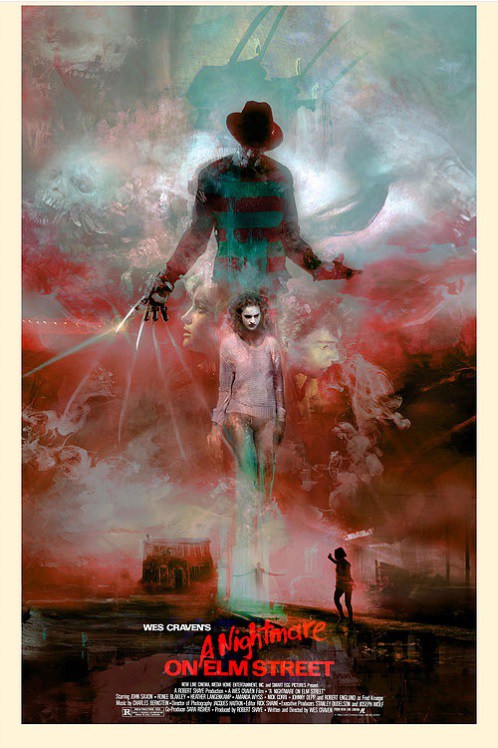
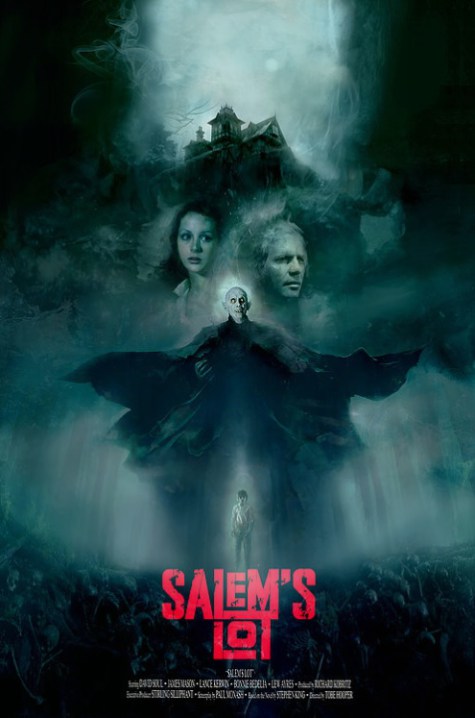
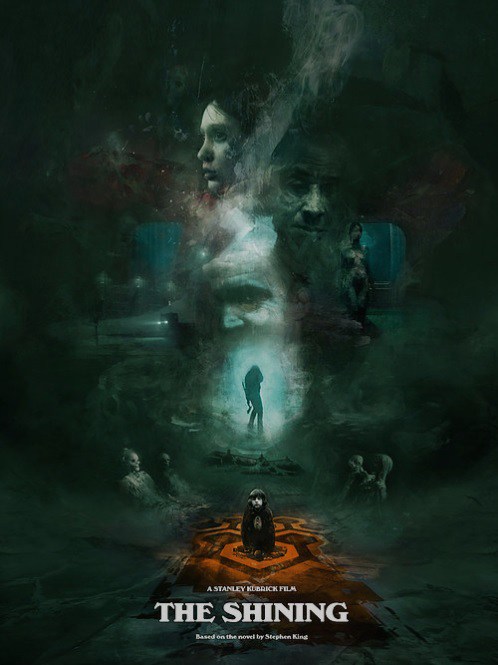
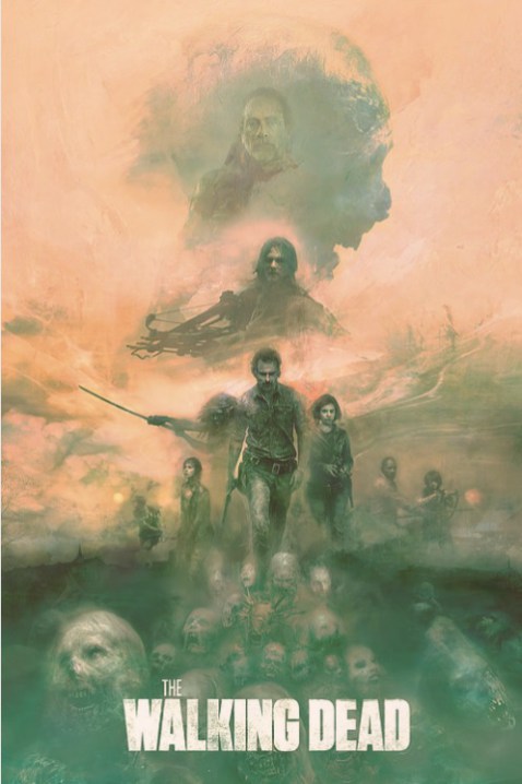
I’m running out of wall space, but I might have to free up some room for these gorgeous watercolor horror movie posters created by artist Christopher Shy. Shy has painted several movie posters in the past, and they’ve all been fantastic – I’m particularly fond of his Blade Runner poster. There’s a dreamy, ethereal quality to his work that instantly catches your eye. There’s also a sense of storytelling at work in these posters – you can get a sense of plot even if you’ve somehow never seen the films in question. It’s impressive as hell.
This time, Shy has created posters for A Nightmare on Elm Street, Salem’s Lot, Event Horizon, The Shining and The Walking Dead. See the posters below (via Bloody Disgusting).
A Nightmare on Elm Street
Here’s the Elm Street poster, titled “Come to Freddy”, recreating Wes Craven’s iconic 1984 film. I particularly dig the way the blades of Freddy’s glove stretch on into impossible lengths.
Salem’s Lot
Next up: Salem’s Lot, with the title “And all around them, the bestiality of the night rises on tenebrous wings. The vampire’s time has come.” This poster captures Tobe Hooper’s 1979 mini-series adaptation of Stephen King’s novel.
The Shining
Here’s The Shining, titles “Danny’s not here Mrs. Torrance”, based on the film by some guy named Kubrick. You probably heard of him.
Event Horizon
My personal favorite of this bunch is Shy’s Event Horizon poster, titled “Hell is just a word. The reality is much worse.” I simply love that someone would devote this much time to Event Horizon, a film that bombed at the box office but has since developed a cult following. Sure, it’s a bit derivative of Hellraiser. But it’s also scary as hell, and Paul W. S. Anderson’s best movie. If I could only pick one poster from this group to buy, this would be it.
The Walking Dead
Last up, here’s The Walking Dead. I don’t even like The Walking dead, and I wish it would just end already. But even I have to admit this is cool. This piece is called “Carl!”, because of course it is.
***
You can pick up these prints, and more, at the Art of Ronin site.
The post Clear Some Wall Space For These Incredible Watercolor Horror Movie Posters appeared first on /Film.
from /Film https://ift.tt/2G8TbpN


No comments: