‘A Quiet Place’ Mondo Poster Captures One of the Movie’s Best Visuals

People weren’t expecting much from A Quiet Place when it was first announced, but John Krasinski‘s high concept horror film took Hollywood by storm when it debuted earlier this year. With its great story hook, quick pacing, excellent performances, and memorable sound design, it’s still one of my favorite films of 2018 so far.
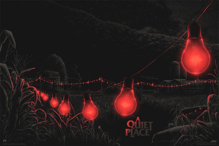
It only makes sense for a film that like to get the Mondo treatment, and now artist Matt Ryan Tobin has reimagined one of the movie’s most effective visuals in the very first A Quiet Place Mondo poster. Check it out below.
A Quiet Place Mondo Poster

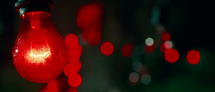
Those red lights are beautiful and evocative, instantly conveying the terror of the situation when things go south and the aliens encroach on the family’s property. Tobin’s version wonderfully depicts the isolation of the land and how this rigged system may be the last line of defense against the worst scum of the universe. So don’t fear us, jeer us, if you ever get near us…*shakes head, snaps out of it* Sorry about that. I started singing the Men in Black theme song and I blacked out for a second.
Tobin’s poster goes on sale at Mondo tomorrow (November 2, 2018) at a random time, but they won’t ship until February of 2019. Follow them on Twitter to give yourself the best chance at scoring a copy. Only 275 of these 36″x24″ screenprints will be available for $50 each, so you’ll have to act quickly.
There’s also a smaller edition of a variant version of the poster for $75 that changes colors in the dark. Krasinski tweeted about it yesterday:
A Happy Halloween indeed! As a huge fan of Mondo, I am honored they made a poster for A Quiet Place!! And no, your eyes do not deceive you… the white lights glow in the dark RED! Huge thank you to @mattryantobin for this incredible design. And to the whole @MondoNews family! pic.twitter.com/oXoAOfXSzp
— John Krasinski (@johnkrasinski) October 31, 2018
When I spoke with A Quiet Place writers Scott Beck and Bryan Woods earlier this year, they talked about the idea for the red lights popping into their head and knowing that specific image had to make it into the final movie:
“That was always one visual that, as soon as the pregnancy starts happening, we’re like, ‘Oh, this family needs to have some sort of emergency system, because they know this is coming. How are they being prepared for it?’ So those red lights just feeling so dangerous in terms of the warning sign was something that made its way into the script, but seeing that in the trailer and again in the final film was just a great execution of that idea. We personally as screenwriters feel like that was executed at the highest level.”
The post ‘A Quiet Place’ Mondo Poster Captures One of the Movie’s Best Visuals appeared first on /Film.
from /Film https://ift.tt/2P3ppLC
No comments: