The Simpsons has a distinct animation style, and that’s thanks to the talented animators who have been working on the series for years. Because that style is so integral to the overall vibe of The Simpsons, there’s a massive style guide for animators to follow so the characters are never feel off from their original design. If you want to see the kind of rules there are for animating The Simpsons, you can see a couple pages from an early style guide thanks to former showrunner Josh Weinstein.
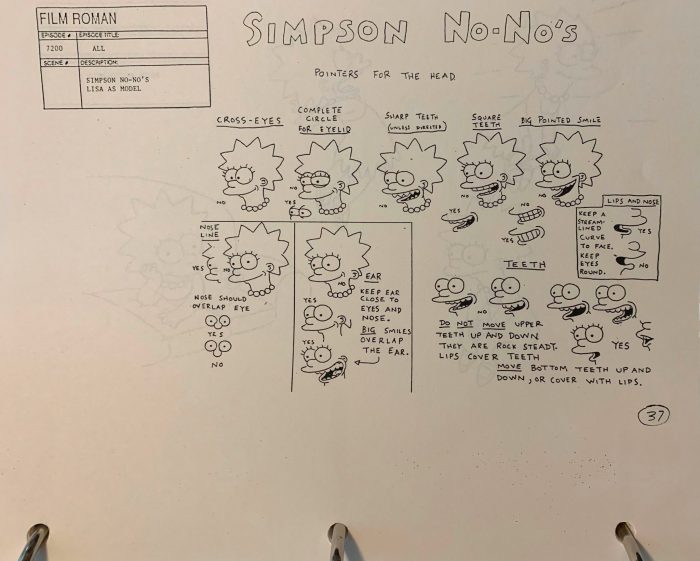
Josh Weinstein posted this image from a “nearly 500-page early style guide, circa 1990″ on Twitter (via Uproxx):

On this page, you see some rules for how to draw Lisa Simpson’s face, specifically the eyes in relation to the nose and her smile. It’s interesting to see the subtle changes that can be made to Lisa’s face that make her look goofy and unnatural from the way we’re use to seeing her. Consistency is so important in animation so that the characters have defined attributes that distinguish them from others, even if it’s something as small as having Lisa’s nose overlap with her eyes.
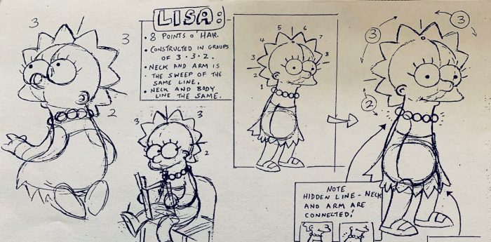
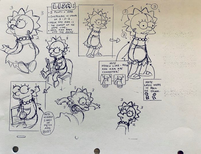
Lisa Simpson voice star Yeardley Smith loved seeing this style guide, and Josh Weinstein shared another page:

In this one, the rules are laid out for how Lisa’s pointy hair should be depicted. No matter what angle we’re seeing Lisa Simpson from, you always see eight points of hair clustered in groups of two or three. Plus, Lisa’s neck line always runs into her body and arm line, even though there can be “hidden lines” for the neck and body behind the armdepending on the angle we’re seeing Lisa from.
This is just two pages out of a huge guide that I’m sure fans would love to see. There’s probably something like this for every character on the show. It would be great if there was an official style guide released in a book for fans to see all these little details for themselves. It could also serve as a manual for aspiring animators to see how well they can match the style of The Simpsons, maybe even so they can one day work on the show themselves (if it’s still around by then).
The animation style of The Simpsons has extended to other shows by Matt Groening, such as Futurama and Disenchantment. There have been changes to the characters over the years, especially when compared to their original iteration, but their character designs are unmistakable, and they will be remembered long after those who created them are gone.
The post Early ‘The Simpsons’ Style Guide Reveals Certain Rules for Animating Characters appeared first on /Film.
from /Film https://ift.tt/3bERBvr
