‘The Art of The Mitchells vs. The Machines’ is Packed with Dazzling Illustrations, Animation Insights & More
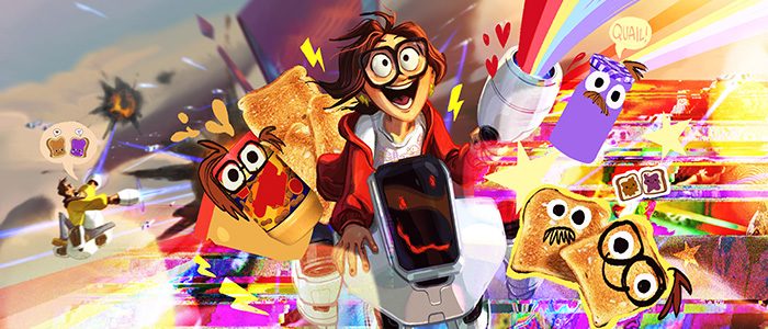
How do you follow up an innovative, visually stunning movie like Spider-Man: Into the Spider-Verse? For Sony Pictures Animation and producers Phil Lord & Chris Miller, the answer was something completely original that pushed the boundaries of animation and delivered a heartfelt, exciting story about a dysfunctional family coming together during a robot apocalypse.
The result was The Mitchells vs. The Machines, a movie from Gravity Falls duo Michael Rianda and Jeff Rowe that was both out of this world and profoundly personal in a number of ways. In the new book, The Art of The Mitchells vs. The Machines, not only do you learn how this incredible adventure came to be after years of development and animation, but you’ll see astounding spreads of artwork that reveal how much imagination and creative freedom was put into this movie, including elements that didn’t make it into the final cut.
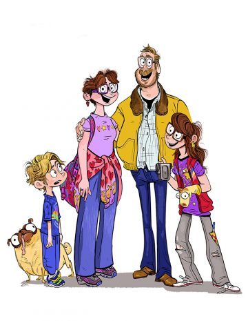

With a movie from the producers of Cloudy with a Chance of Meatballs, The LEGO Movie, and Spider-Man: Into the Spider-Verse, you know you’re in for a spectacular adventure full of mesmerizing visuals, witty comedy, and a big beating heart. But in the case of The Mitchells vs. The Machines, the movie actually starts with director/co-writer Michael Rianda and his Gravity Falls cohort Jeff Rowe, who co-directed and co-wrote the film with him.
The Art of The Mitchells vs. The Machines begins by recalling how Rianda and Rowe looked back at their experiences growing up as creative individuals struggling to find a place to belong, something that would appeal to many of the artists working on this movie. Rianda in particular pulled many personal details from his father’s contentious relationship with technology and love of the outdoors. And both of the filmmakers hoped to tell a story about a family that was far from perfect, one that lived in a messy, middle-class, Michigan home. It just so happens that this family gets caught up in the robot apocalypse and somehow become the only people who can stop it.
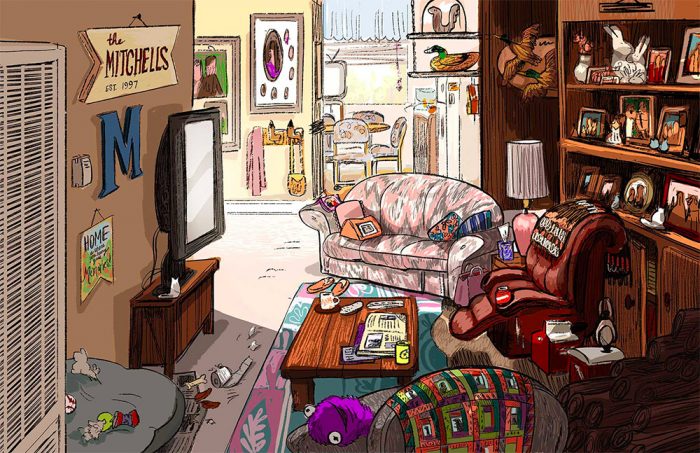
Insights from the development of this sci-fi adventure come from key crew members such as production designer Lindsey Olivares, head of story Guillermo Martinez, art director Toby Wilson, lead color designer David R. Bleich, VFX supervisor Mike Lasker, and head of character animation Alan Hawkins. That’s all accompanied by a rich tapestry of storyboards, concept art, rough sketches, and more, each piece providing a new look at this eccentric family.
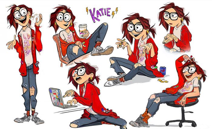
The artwork that accompanies the behind-the-scenes anecdotes literally illustrates that no idea was too off-the-wall for consideration in The Mitchells vs. The Machines. The character designs for the Mitchell family alone show how much exploration was done to give this film just the right kind of quirk and originality to stand out from the rest of the animated family adventures out there. There’s a two-page spread in this book that reveals the wide variety of hairstyles, wardrobes, and facial features that were considered for the main character Katie alone (trust me, they’re more varied than what you see below).
The Art of The Mitchells vs. The Machines highlights the progression from naturalistic and irregular imagery representative of The Mitchells to the polished, polygonal design of PAL’s robots and their techno-world that starts to take over Earth. It explores the traits of the narrative framework of “Katie-vision” that emulates the zany style of her wacky homemade films starring Monchi, the bulge-eyed pug. There are even mentions of changes made to the movie as it went through various stages of development, from losing a sequence where the family had to kidnap the President of the United States (Barack Obama at the time) to one of the early titles for the movie, which was Control Alt Escape. Plus, you get a much better look at images that flash by in the blink of an eye, including digital family photos showing the years that the Mitchells have spent together.
In fact, one of the more fascinating changes in development reveals that there was once an action-packed finale that involved a massive PAL-controlled mech made up of computers, cars, slot machines, appliances, construction vehicles, and pretty much any electronic device that could be controlled by the artificial intelligence gone mad. Another take on the massive mech took a more sleek polygonal approach in the style of the PAL headquarters. Not unlike the various character designs for the Mitchell family, there were endless possibilities proposed for this giant machine that didn’t even make the cut. In fact, a recently released storyboard sequence of a deleted scene revealed an unused climax where the mech brought back the giant Furby. It’s crazy how drastically animated movies change throughout production.
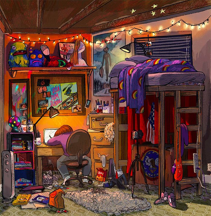
But I think the best details in The Art of The Mitchells vs. The Machines come from the careful attention to quirky character traits. There are several-page spreads that get up close and personal with these characters and their style, from the explosion of cinema and color in Katie’s room to the droves of dinosaurs carefully placed around Aaron’s. There’s also a special focus on the kind of stuff you’d never even think about while watching the movie. For example, Katie’s fingers were given an especially irregular and squishy design and careful attention was paid to how she holds things like her cell phone and camera. Aaron’s hair tuft could never cover both of his eyebrows, and stray hairs should always be sticking out the back. Even Rick’s beefy anatomy was broken down in great detail to figure out how to best move him as a character.
For fans of The Art of The Mitchells vs. The Machines, this is a fascinating deep dive into the creation of one of the most visually engaging and endearing movies in recent memory. For you aspiring animators out there, let this serve as a guide to the endless work that goes into creating animation that serves both story and style. And maybe you’ll walk away with a little inspiration to color outside the lines, whether that’s on a sketch pad, computer tablet, or just in your everyday life.
The Art of The Mitchells vs. The Machines is available for purchase today.
The post ‘The Art of The Mitchells vs. The Machines’ is Packed with Dazzling Illustrations, Animation Insights & More appeared first on /Film.
from /Film https://ift.tt/3weLHev
No comments: