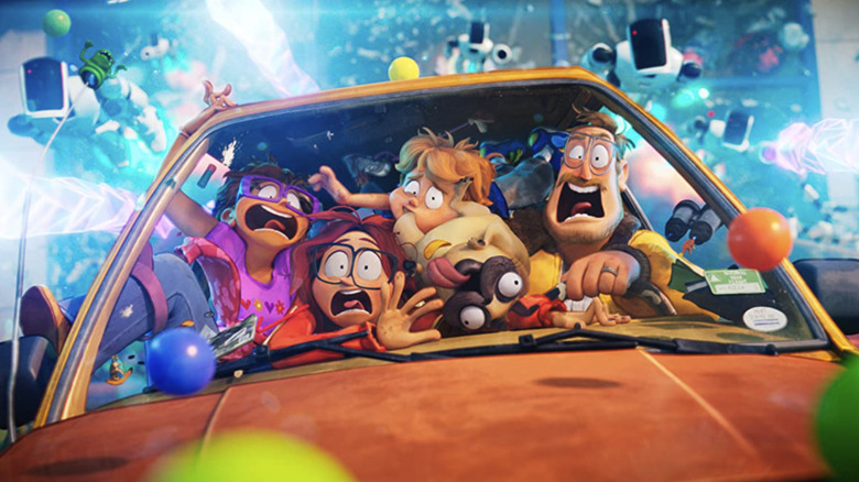
Director Mike Rianda's manic, good-hearted family comedy "The Mitchells vs. The Machines" is one of the best-reviewed movies of 2021 and Netflix's biggest animated movie yet. As the year comes to a close, you'll likely be seeing it pop up on several year-end lists -- probably even here on /Film. I have my issues with aspects of the movie, but the one thing that absolutely knocked me out was the film's incredible visual style. Instead of leaning on ultra-realism like so many modern American animated movies tend to do, this movie embraces a distinct, watercolor-inspired look which required Rianda and his team to "break every aspect of filmmaking" in order to pull it off.
During last week's Infinity Festival, Rianda participated in a panel with visual effects supervisor Mike Lasker and producers Phil Lord and Chris Miller ("The LEGO Movie," "21 Jump Street"), and the group spoke about how they crafted the movie's standout visual aesthetic, the technical requirements of maintaining that cohesive style, and how doing something nobody has seen before is the best way forward in Hollywood.
A Visual Style That Matches Its Characters
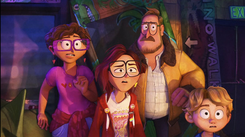
The Mitchells, the dysfunctional family at the center of this story, are frequently juxtaposed with a "perfect" family throughout the movie, seemingly falling short by comparison. It's only at the end of the film that the Mitchells realize their dysfunction is what allowed them to save the world, and they finally learn to embrace their shortcomings instead of trying to force themselves to be something they aren't. As Mike Rianda explained, he wanted the idea of the Mitchells being flawed to come through in their character designs – especially when compared to the robots that try to take over the planet.
"We basically figured out a way to take our story, which is about imperfect people, and have the visuals reflect that in every frame. Because the Mitchells are irregular and broken and dysfunctional, so they should look chunky and wrinkly and irregular. We tried to put that in every frame of the movie and then contrast that with the robotic side of things, where everything is perfect and straight angles and stolen from Stanley Kubrick movies."
"We Had To Break Every Aspect Of Filmmaking"
Lasker, Lord, and Miller previously worked together on "Spider-Man: Into the Spider-Verse," a movie which pushed the boundaries of what modern animation could look like and was handsomely rewarded with an Academy Award. The team wanted to continue to push those boundaries with "The Mitchells vs. The Machines," but in a way that made sense for this specific story. According to Lasker:
"We had to break every aspect of filmmaking. A lot of things that we would take for granted and always do the same way, we had to do a completely different way. Whether it was how we do depth of field, we had to break it up with texture, and just how we modeled and lit and how things interacted with each other. One of the hardest things in the film was getting these characters to exist in two different looks and have the style maintain and feel cohesive. Even how we would rig things, how eyes would work, how the hair would [simulate] – it was doing things differently than what we were typically used to. Every artist had to get on board, learn the way to do it, get efficient at it, and master the tools to get the look to work."
Rianda explained it like this in "The Art of The Mitchells vs. The Machines" book:
"We had to break all of the previously existing software. We taught a computer to draw like a person – to teach it to recreate the wonderful line work of the artists' drawings. We created tools to make the whole world look like a watercolor illustration. We created dynamic shading tools that created watercolor textures in all the shadows that move with the characters. We created simplification tools to get rid of the types of details computers love, but humans would never draw. We created brand-new special effects filled with hand-drawn animation to bridge the gap between 2D and 3D. We added handmade animation and photo collage to the screen at various points to make sure that it all looks like the movie is from the point of view of our teenage artist protagonist Katie Mitchell."
Look Into The Light
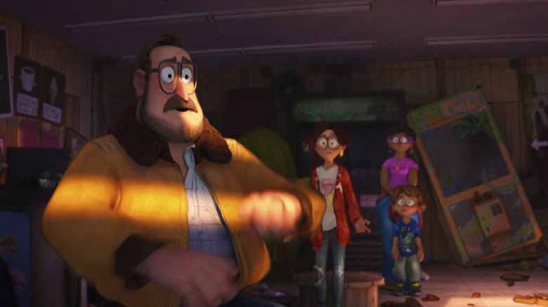
That watercolor look is the type of thing that sounds good on paper, but is actually immensely more complicated than it seems when it comes to actually executing it. Chris Miller explained the lengths the team went in order to maintain the integrity of that look throughout every aspect of the movie:
"Even the light was watercolor. In 'Spider-Verse,' we had the light be Ben-Day dots, which is like comic book dots, and figuring out how to make light behave that way and not be distracting when it hit, say, Miles' face, was really tricky. But this was about, 'How do we make the whole world feel like it's a painting?' Part of that meant that the light itself couldn't be perfect CG realistic light. It had to also be painted light. So there's actually watercolored, textured light that's spilling onto all the objects and characters. It was complicated."
Lasker elaborated on that point:
"We knew to make it convincing, any texture breakup in the lighting couldn't look like it was mapped on – otherwise, it would just like it was texture painted. So we developed this tool that would dynamically change based on light direction. So as a light swung around, you'd see the textures build up on each other. All of those brush strokes we controlled on a shot basis. I thought it was important that every artist working on a shot could make it work for that shot and inject their own artistry. So they would choose brush strokes that worked well with the angle and the distance from camera, so no two shots were alike. I think that was what worked really well on 'Spider-Verse' and what worked really well on this film: inconsistency is the consistency."
The Most Challenging Element To Get Right
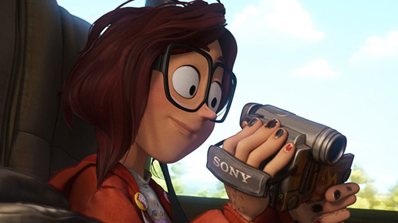
If you've seen the film, you know it explodes into chaos in the third act as the Mitchells face off against the machines in a last-ditch attempt to save the world. You might think one of the shots from that explosive climax would have given the filmmakers the most trouble, but as Chris Miller revealed, the culprit was something much more mundane:
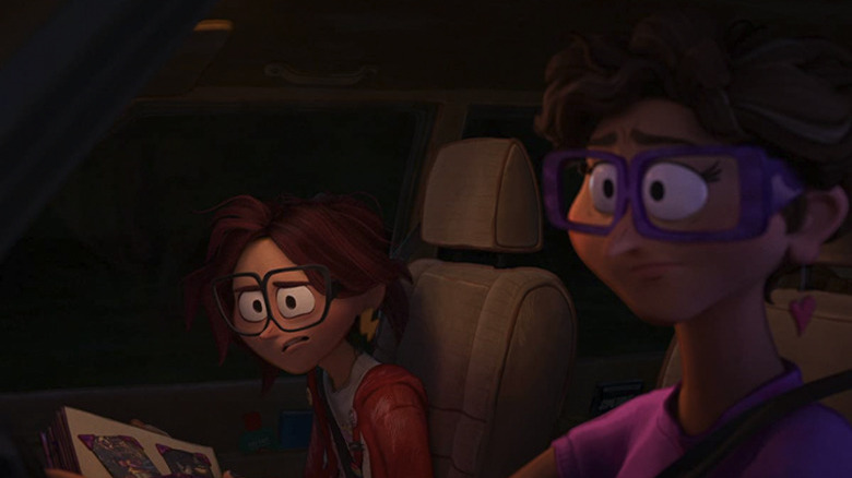
"People don't realize that Katie Mitchell's hair was probably the hardest thing we had to do, because it had to move like hair, but it had to look like a painting. If you were painting hair, you'd paint a solid shape and put some little lines on top of it. But if you just do that in CG, it looks like she's wearing a weird helmet. So it had to move as though it was millions of individual hairs, but look like a mass painted by an artist. So making that work was a real challenge."
"Uniqueness Drives The Marketplace"
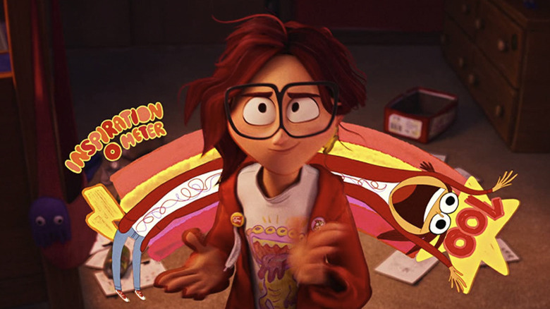
Despite working on several projects that were based on existing properties, Phil Lord and Chris Miller have built their careers on the central idea that "uniqueness drives the marketplace." It's a mantra they've spoken about in the past, and Miller reiterated it again in terms of why "The Mitchells vs. The Machines" team worked as hard as they did to create something fresh for audiences:
"We're big believers that uniqueness drives the marketplace and people want to see something they haven't seen before. It's your job to deliver them something they haven't seen before. Because they're a lot of things out there to watch. On Netflix alone, there are so many things. You've gotta give them something that doesn't look like a million other things. You've gotta give them an experience they can't get anywhere else. If you want to look for a string of successes, that would be the way to do it."
Read this next: The 14 Best Animated Movies (That Aren't Made By Disney Or Pixar)
The post The Mitchells vs. The Machines Team Broke 'Every Aspect of Filmmaking' to Create the Movie's Unique Look appeared first on /Film.
from /Film https://ift.tt/2ZXyXhv
